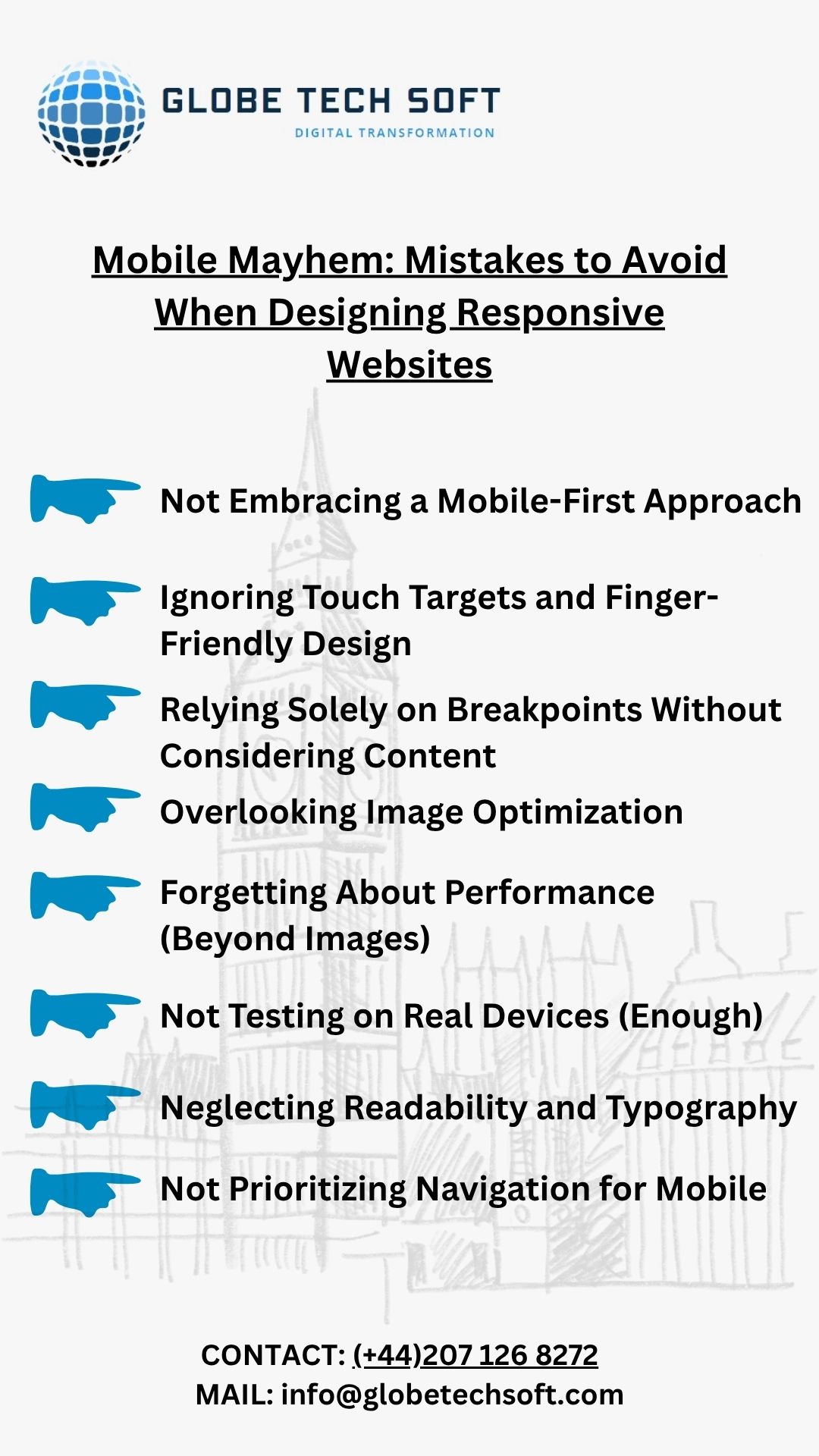
Mobile Mayhem: Mistakes to Avoid When Designing Responsive Websites
Mobile Mayhem: Mistakes to Avoid When Designing Responsive Websites
In today’s mobile-first world, a responsive website isn’t a luxury – it’s an absolute necessity. Users expect seamless experiences across all devices, from a sprawling desktop monitor to the smallest smartphone screen. Yet, despite a widespread understanding of its importance, many websites still struggle with true responsiveness, leading to frustrating user experiences and lost opportunities.
So, what are the common pitfalls that lead to “Mobile Mayhem” when designing responsive websites? Let’s dive in and identify the mistakes you need to avoid.
Mistake #1: Not Embracing a Mobile-First Approach
This is perhaps the most fundamental error. Many designers still default to designing for desktop first, then attempting to “shrink” or “adapt” the layout for smaller screens. This often results in clunky, compromised mobile experiences.
The Fix: Start with the smallest screen. Prioritize content and functionality for mobile devices first. What’s essential? What can be condensed or hidden? Once you’ve perfected the mobile experience, then progressively enhance it for larger screens. This forces you to think about core content and user flow from the outset.

Mistake #2: Ignoring Touch Targets and Finger-Friendly Design
On a desktop, you have a precise mouse cursor. On mobile, you have fingers. Tiny buttons, tightly packed links, and uncomfortably small input fields are a recipe for frustration and accidental taps.
The Fix: Design generously sized touch targets (at least 48×48 pixels) with ample spacing between them. Think about how a user will physically interact with your site. Ensure forms are easy to fill out and navigation elements are easily tappable.
Mistake #3: Relying Solely on Breakpoints Without Considering Content
While breakpoints are crucial for adapting layouts, simply setting a few standard breakpoints (e.g., for tablet and mobile) isn’t enough. Content itself can dictate when a layout needs to shift, regardless of fixed screen sizes.
The Fix: Use a “content-out” approach. Design your content blocks first, and then apply breakpoints based on where your content starts to break or become unreadable. Test your design with varying amounts of text and imagery to see how it flows across different screen sizes.
Mistake #4: Overlooking Image Optimization
Large, unoptimized images are a death knell for mobile performance. Users on cellular data plans will quickly abandon a site that takes ages to load.
The Fix: Implement responsive images using srcset and sizes attributes to serve appropriately sized images based on the user’s viewport. Utilize modern image formats like WebP. Compress images without sacrificing quality. Lazy loading images below the fold can also significantly improve initial load times.
Mistake #5: Forgetting About Performance (Beyond Images)
While images are a big culprit, overall website performance is critical for mobile users. Excessive JavaScript, bulky CSS, and too many HTTP requests can slow down your site to a crawl.
The Fix: Minify your CSS and JavaScript. Combine files to reduce HTTP requests. Leverage browser caching. Consider using a Content Delivery Network (CDN) to serve assets faster. Regularly audit your website’s performance using tools like Google Lighthouse.
Mistake #6: Not Testing on Real Devices (Enough)
Emulators are great for initial testing, but they can’t fully replicate the nuances of real-world device performance, touch interactions, and network conditions.
The Fix: Test your responsive website on a variety of actual devices – different phone models, operating systems, and tablet sizes. Pay attention to how elements render, how touch gestures work, and how the site performs on different network speeds. Get feedback from real users.
Mistake #7: Neglecting Readability and Typography
Text that’s too small, too large, or has poor line height on mobile can be incredibly frustrating to read. What looks good on a desktop might be illegible on a phone.
The Fix: Pay close attention to font sizes, line height, and line length for different screen sizes. Ensure sufficient contrast between text and background. Use fluid typography techniques to adapt font sizes smoothly across breakpoints.
Mistake #8: Not Prioritizing Navigation for Mobile
A complex, multi-level navigation menu that works well on desktop can become a nightmare on a small screen.
The Fix: Simplify your navigation for mobile. Consider using a hamburger menu, off-canvas navigation, or other mobile-friendly patterns. Prioritize the most important links and make them easily accessible.
Conclusion
Designing a truly responsive website requires a shift in mindset and a meticulous attention to detail. By avoiding these common mistakes and adopting a mobile-first, performance-driven, and user-centric approach, you can create a seamless and enjoyable experience for all your users, no matter what device they’re using. So, banish the “Mobile Mayhem” and start building websites that truly shine on every screen!


